Any large-scale website or app can benefit from some sort of design system. Styleguide, pattern library, component library… they all help streamline product design and provide a certain consistency. It also serves as a single source of truth when you’re dealing with multiple design teams across different teams in an organization.
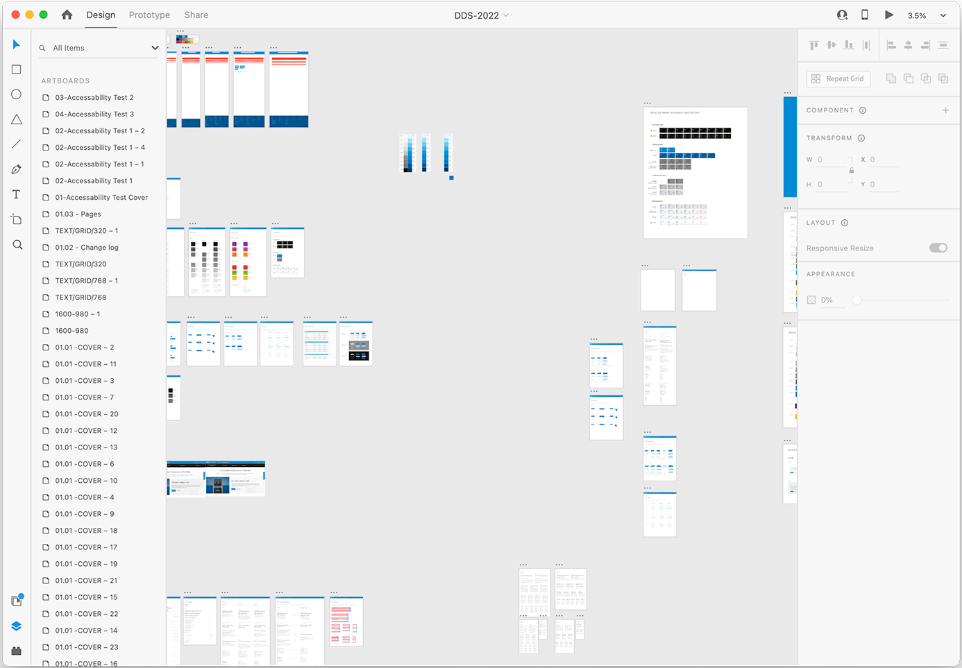
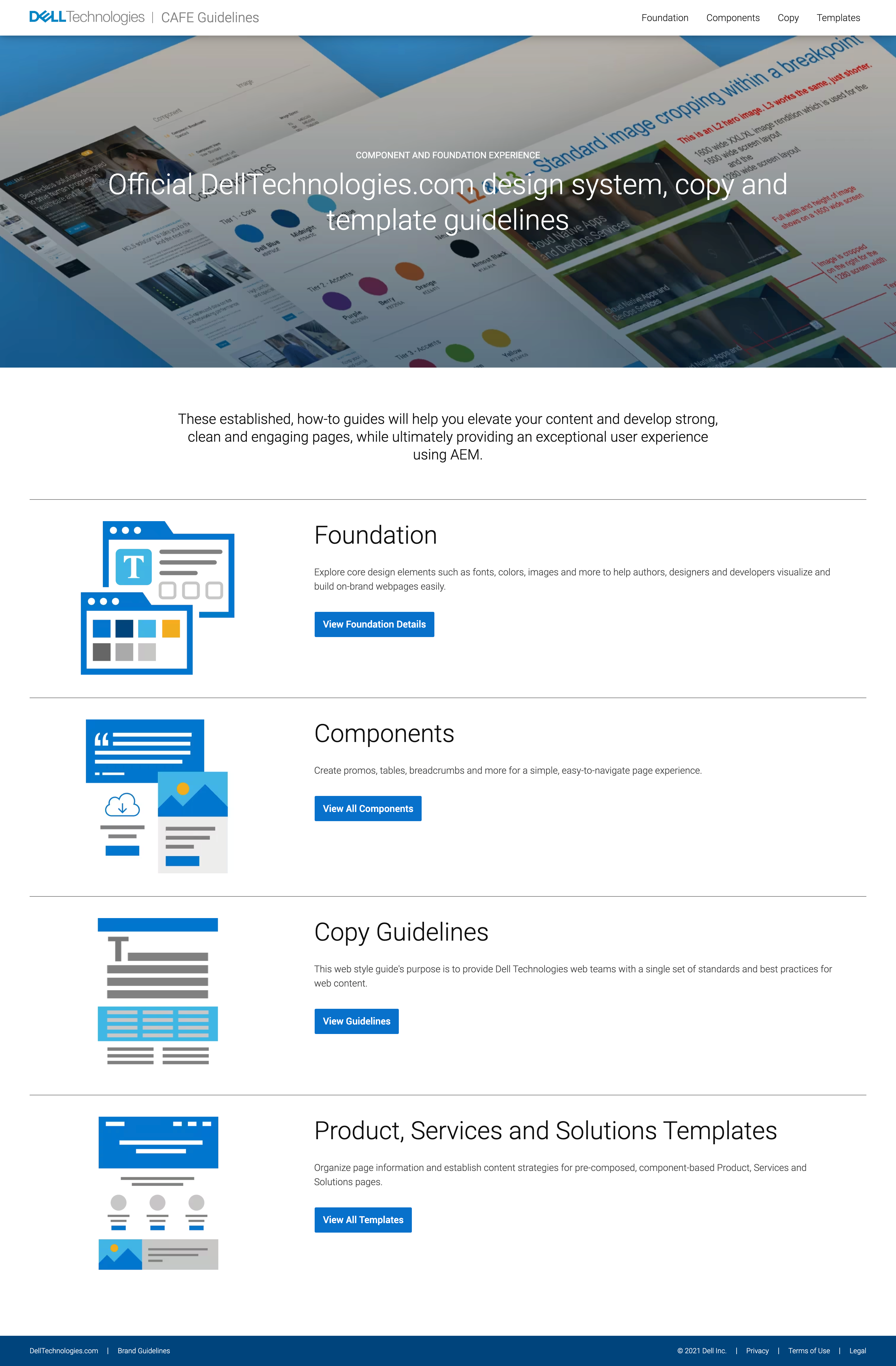
We needed one at Dell to facilitate quicker development, consistent design, and easier future updates. When I started at Dell we had three different websites, with three different code bases, styles, and design languages. My first task was to merge two, DellTechnologies.com and DellEMC.com into one site, and design a component library. The sites were built using Adobe Enterprise Manager (AEM), so we needed to standardize all the aspects of the site. Since the Framework was already chosen by the developers (BURBN) we needed to pick what to standardize and come to consensus on what the standards would be. Using Atomic design we broke it down as follows:
Atoms
Our global stylesheet. Core elements for authors, designers, and developers to visualize and build on-brand webpages easily.
Molecules
“Building blocks” allowing authors t to quickly create webpages without the need for designers and release queues.
Compounds
Template pages to help authors organize page information and establish content strategies with pre-composed, component-based pages.
The primary goal was to move our department from 60% free-form/nonstandard designs to 80% component work and 20% free-form.
Western Union was a little different in that it’s a web-based application with very little content. But over the years with different designers and different engineers working on it, the stylesheet ballooned to over 30k lines and design was all over the place. For example, we used a green circle and shaded box to denote success from a transaction. There were 17 different green circles (different sizes and shades) and 21 different green boxes. It was a total mess. Errors weren’t handled consistently, even labels on forms were all over the place.
Even though it was tedious I decided the best way to fix it was to print out all of the different screens and their permutations, and catalog each item on each page. I built out an inventory and categorized them in to buckets and hierarchies, e.g., forms, form fields, buttons, ctas, errors and the like.
I then had to assemble a team of designers across the org to workshop and come to a consensus on what we wanted it to be. Some were super easy since we mimicked Angular and Material. But others needed to be specific to WU based on brand or tech considerations.
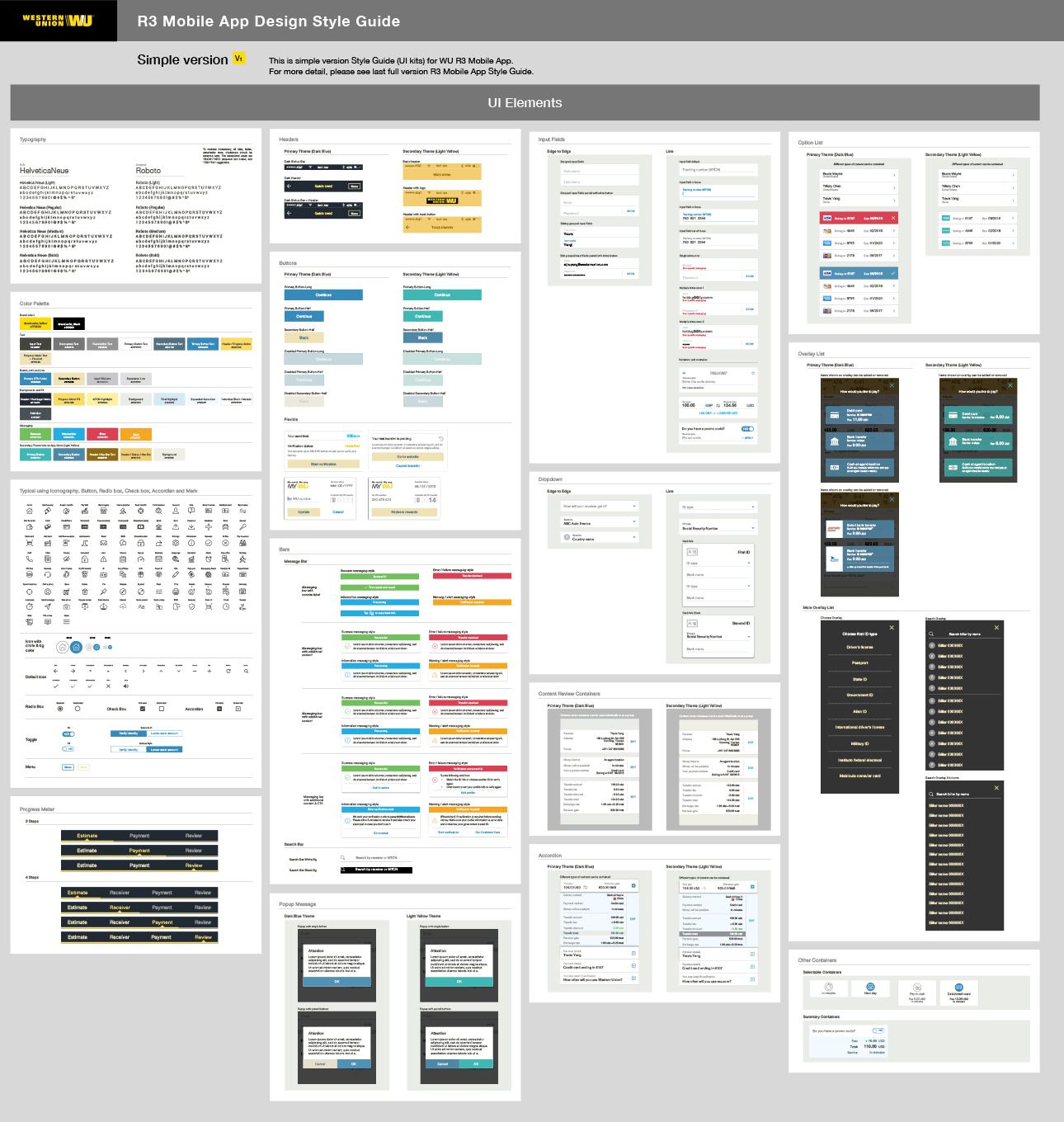
With the rollout of the styleguide we reduced the number of lines in the global stylesheet to approximately 1000, and rolled these styles out to all instances of the app and four global design teams.
Copyright © 1995 - 2023 Paul Clark