Dell Recycling Solutions

Hero

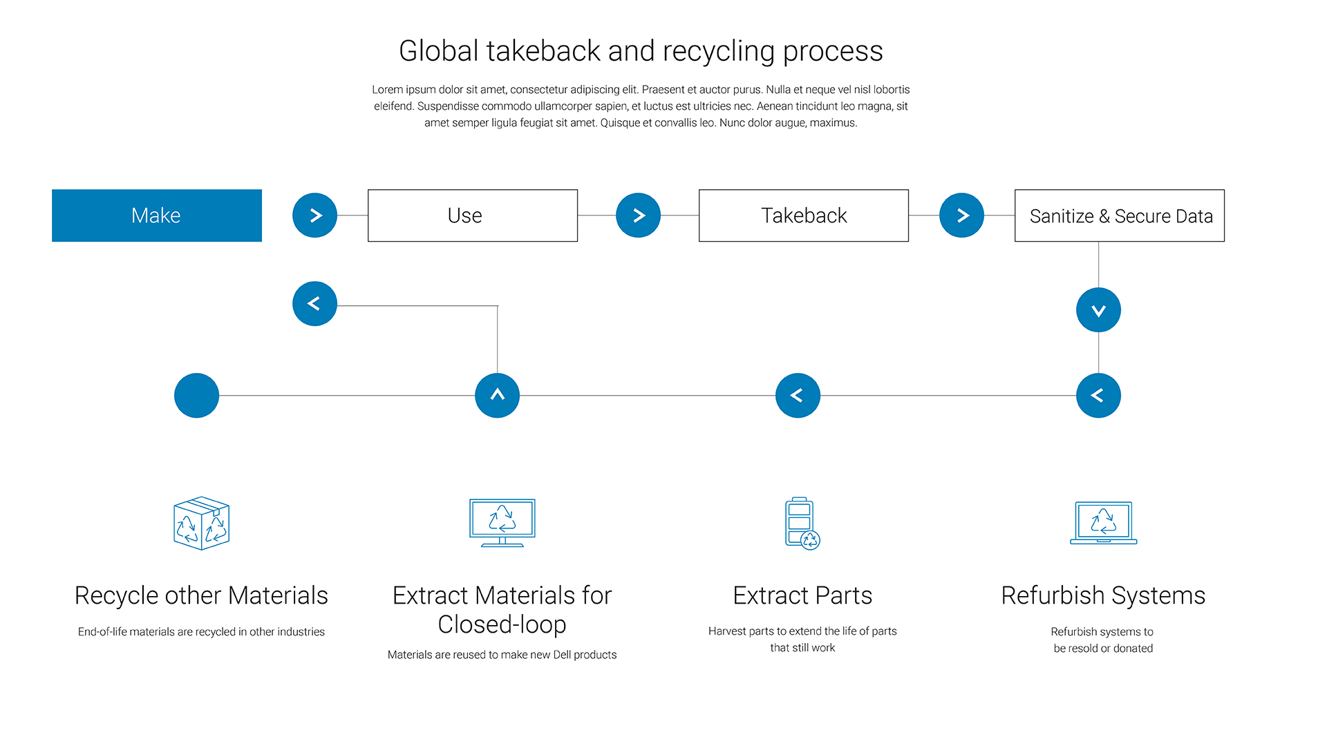
Background: Many people didn’t know Dell offered a recycling program. We needed toconsolidate the experience by bringing third party forms in-house and create net new learn layer page and redesign recycling tool to align with homepage look/feel and modernize functionality.

Process

Heuristic Evaluation

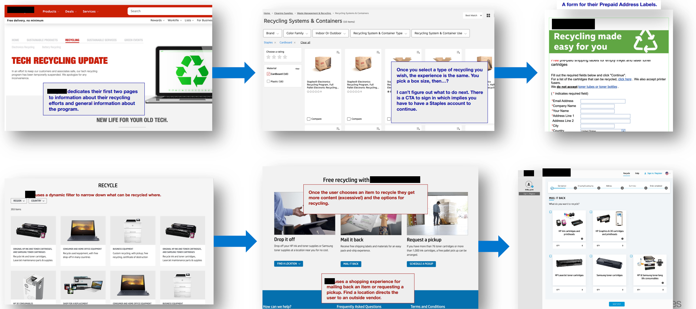
Before beginning anything I took a cursory, critical. look at the previous tool. A few things I noted:

  • People would navigate through the tool, click “Return to Dell” and currently they are taken off the site to a third-party form rather than it being an integrated experience
  • We exposed several vendors rather than a single one, which seemed confusing
  • Tool didn’t work properly in desktop view, and I consistently missed a label for online shipping Trade-in option was hidden
  •  We lose half of our traffic from “Return to Dell” and “Online Shipping Label” page. Too many clicks for our users.
  •  “Trade-In” and “Return to Dell” options have more engagement rate of ~90% compared to “Donate to Dell Reconnect” with ~76%
  •  PCs and Laptops Option has higher clicks of 7,223 compared to Computer accessories, battery and ink and toner options
I took my findings to form the hypotheses for our research.

Research

Through a series of surveys and user interviews we were able to determine:

  • Our users weren’t aware of the recycling options available to them. Options weren’t very clear to them.
  • Users felt it took a lot of thinking and steps/clicks to reach page where they can get information on recycling.
  • We should provide straightforward CTAs/navigational buttons.
  • Provide a way where users can select multiple items to recycle – not just one.
  • We lose half of our users on the mail-back page (right before the third-party form). Too many clicks for our users to get to where they want to go.
  • Page structure does not allow users to quickly understand context.
Competitive Research

I evaluated several similar tools, not limited to recycling computers and accessories

Competitive Research


User Flows

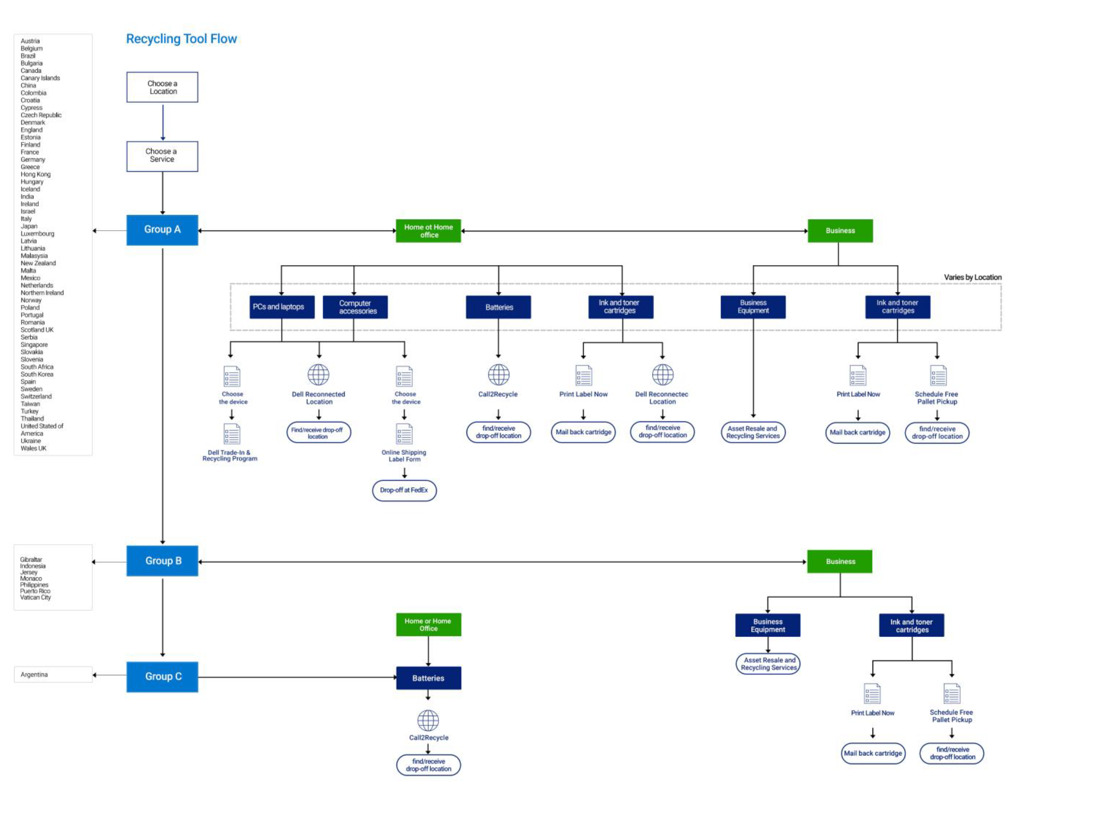
Because the tool would launch in different geo locations, with different criteria for each one I needed to create a sitemap/flow to show stakeholders the complexity of the tool. Not only does this help in planning what pieces will be developed when but shows stakeholders all of the different decision and end points.

PCs & Laptops

Wireframing and Prototyping

As the tool was to be built using mostly components from our AEM library I was able to quickly wireframe out the experience. Using Adobe XD I could show small interactions to inform the Developers on what we would be looking to do. I use this phase as a sanity-check, on what we can do, and what technical debt we were looking at.

alternative

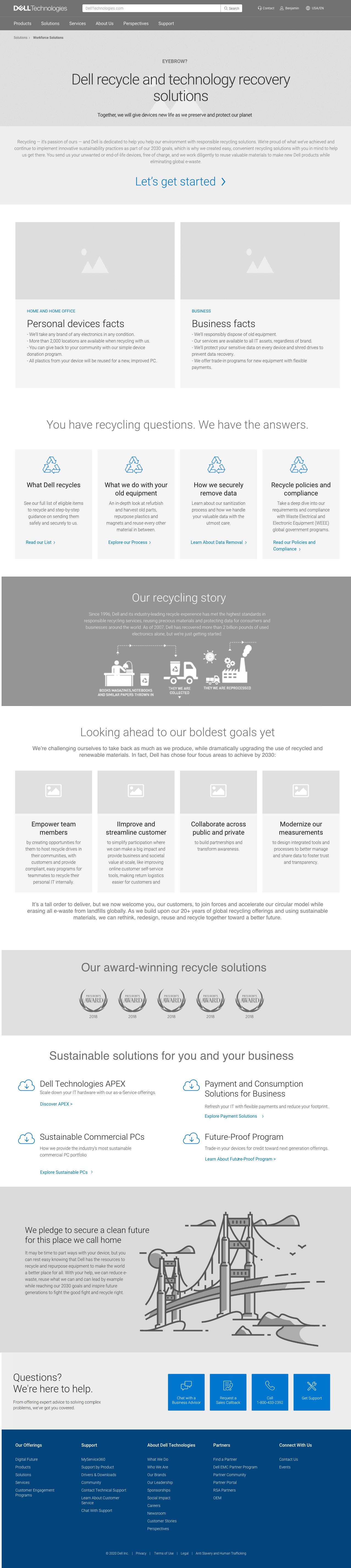
After multiple revisions and a tech review by IT we moved into final design and coding.

alternative

Conclusion

We launched the new tool in phases. Approximately 3 months after the launch of phase 1 we observed:

  • An increase of 10% (so far) in recycled units
  • Total Visitors up 2,058 
  • Average time spent up 1:38 
  • Bounce Rate Down 6.2% 
  • Average Scroll Depth down 44.92% 
  • Interaction Rate up 94%